
Logo Design and Corporate Identity
A logo is a like a jewel that can inform people about what you stand for, what you do, and make people recognize your company and promote your brand.
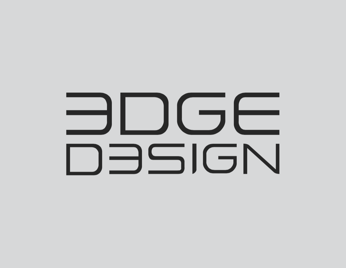
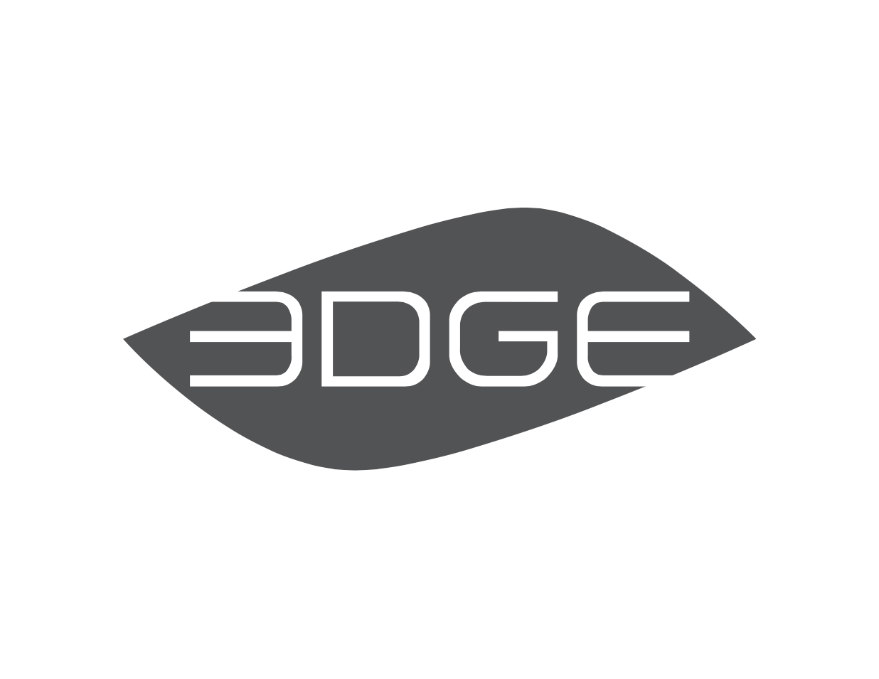
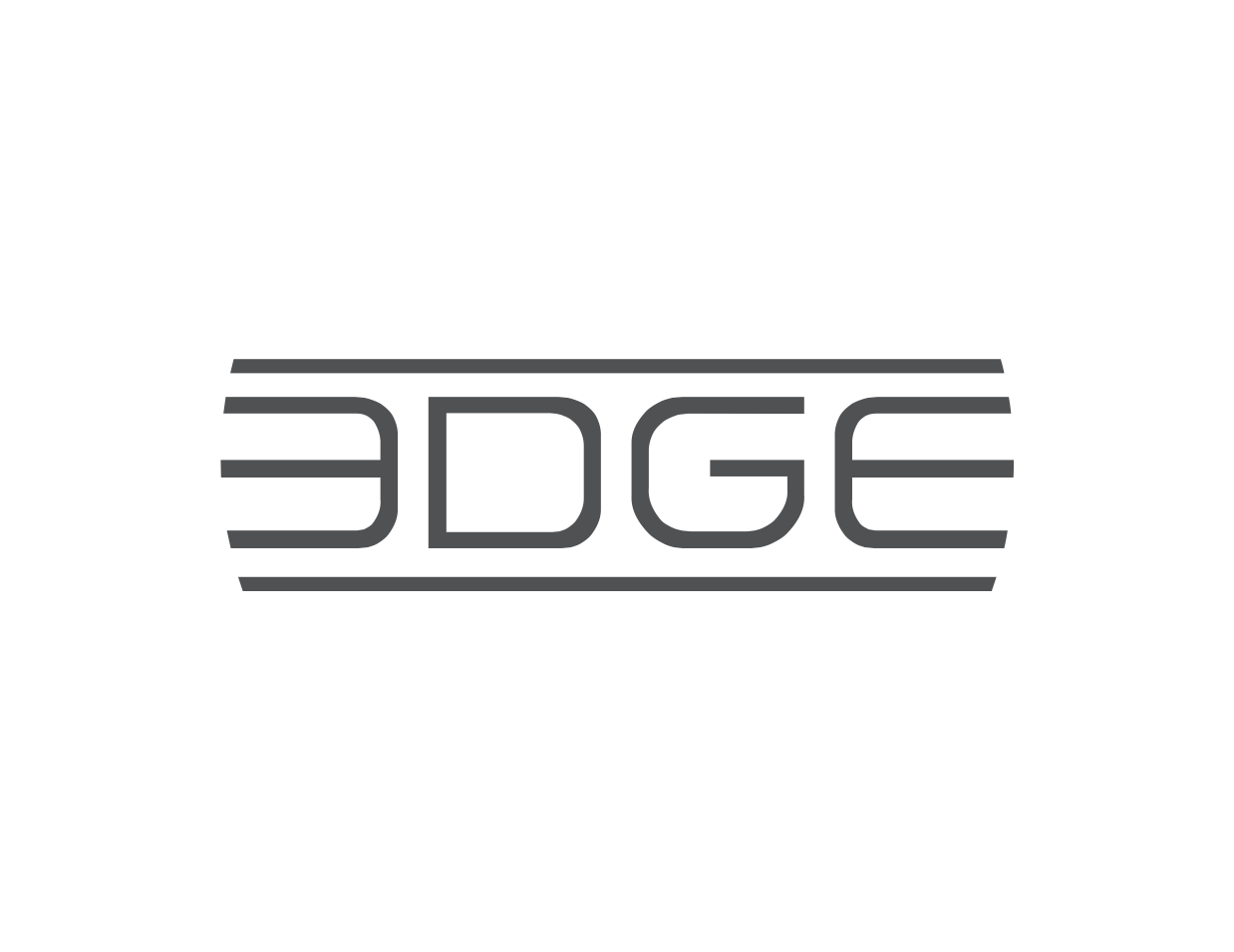
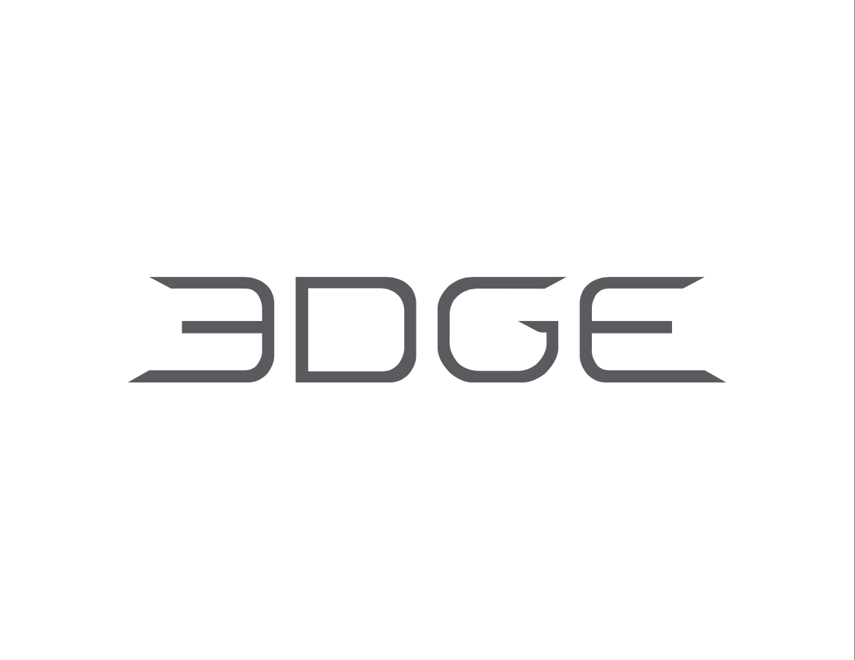
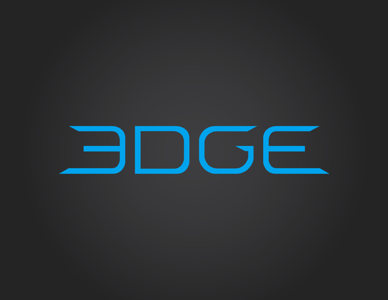
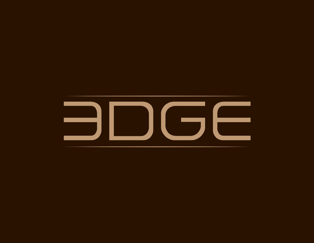
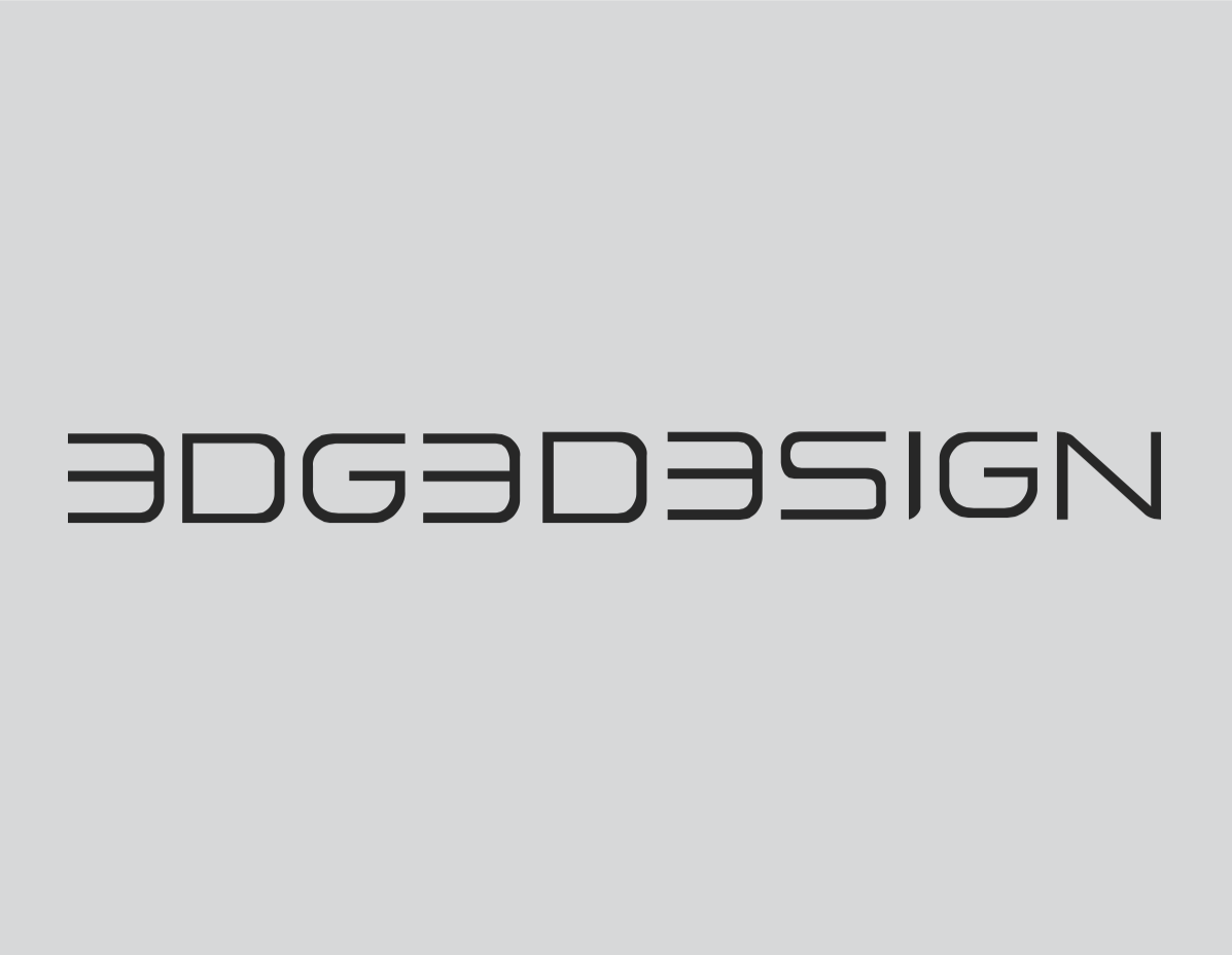
EDGE International
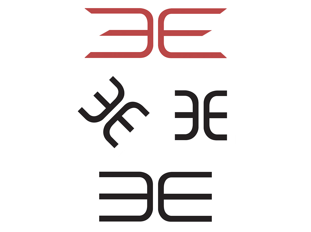
The first version of the EDGE logo was simply a modified version of the Sol typeface with the first E reversed. The logo was manually transformed from this initial starting point and split in to the EE-symbol as well as the logo-name. One initial idea was to make the EE logo square so it could be easy to create a pattern out of, but the more rectangular version was chosen. Given the fact that the logo would be CNC milled into the backside of the aluminum cases some versions of the EE logo had rounded endpoints/corners, but the final EE logo ended up with right angle corners.
Travel & Learn Study Tours
A startup needed a new logo for their business, arranging study tours. Use of bridge highlight a crossing, a new adventure on the other side, where knowledge and memories are born. Adding an airplane reinforces the message of travel, and far flung destinations.
The final result and a few proposals that were developed:
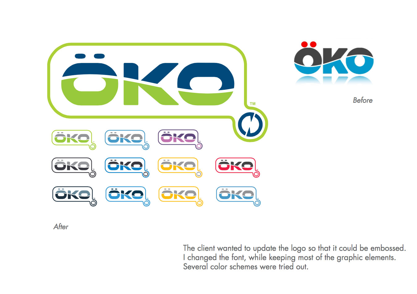
Öko Bottles
The Öko bottles logo needed an update. I took the approach that the colors needed to be more coordinated, and use a custom font I created.
I also kept the original idea of the intersecting wave, while adding an outline that integrated recycling arrows. The changes I made also made the logo easier to emboss in plastic molds, potentially reducing manufacturing costs.
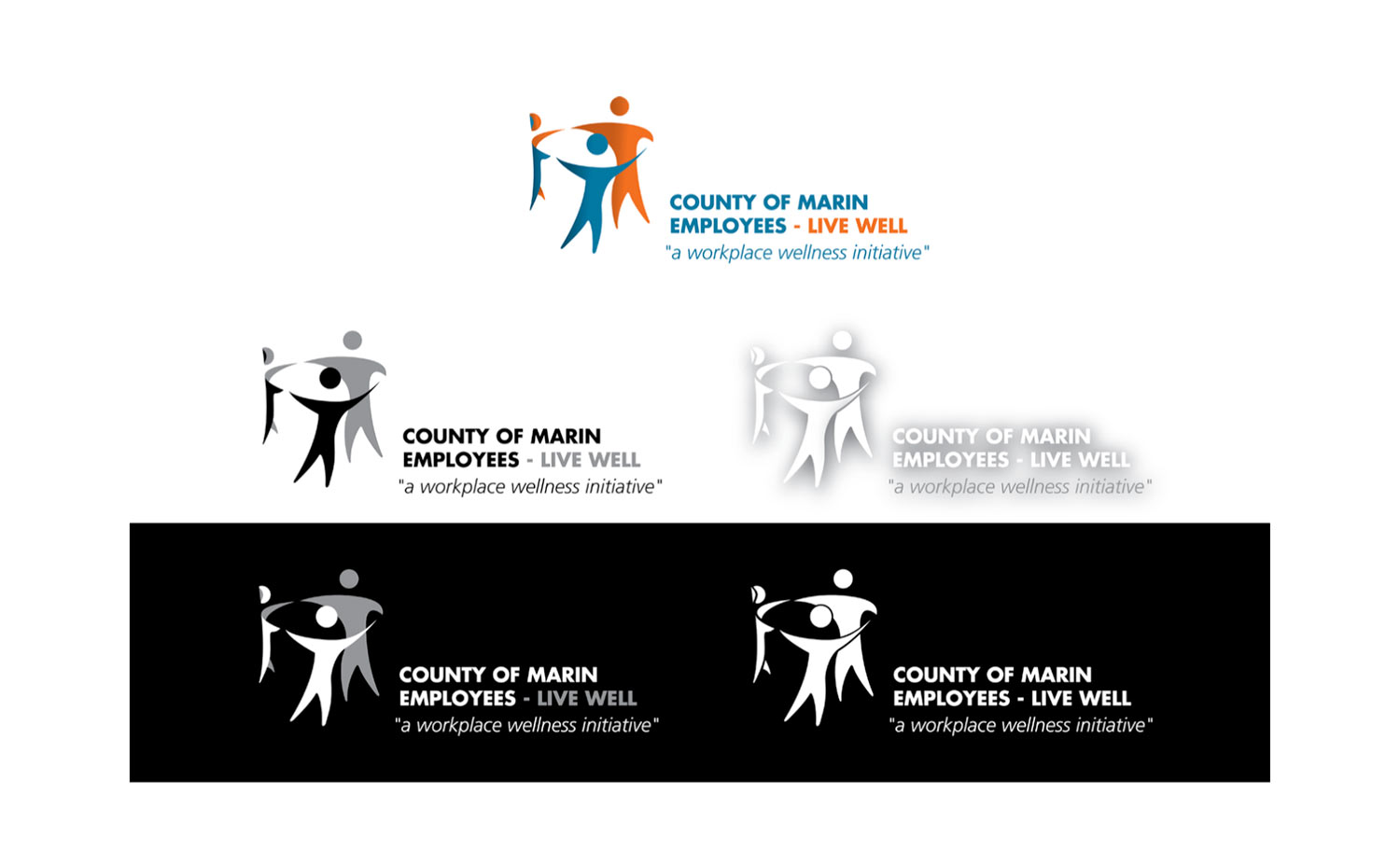
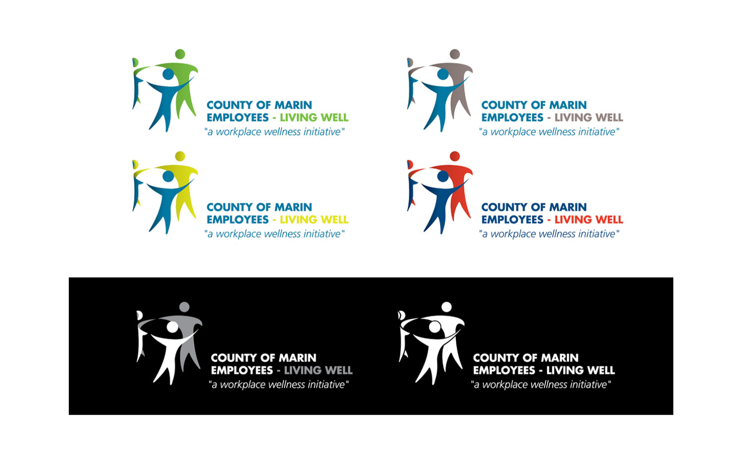
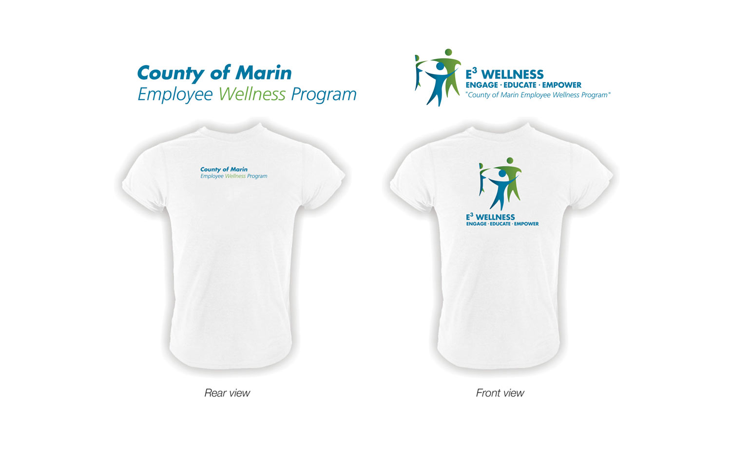
County of Marin (California)
The County needed a logo for their new program to promote health and wellness. Here are a few versions of the logo that was delivered.
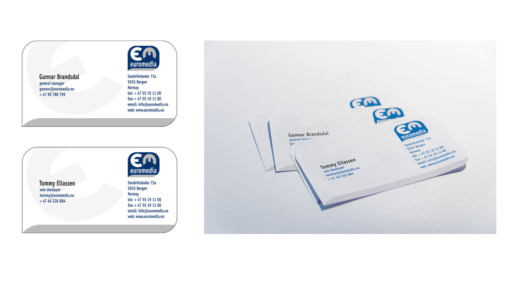
Euromedia
I was tasked to create a new logo and stationary for a online services company, and started with quick sketches on paper revolving around their name, Euromedia. With logo established, I established typefaces, colors and stationary. The shape of their business cards had three rounded corners, same as their logo.
Miscellaneous logos